DMT-Nexus member
Posts: 32 Joined: 28-Aug-2011 Last visit: 06-Jul-2021
|
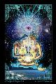
Is the banner meant to be dynamic, or are several of them being tested out? Jslattum's is definitely the best. It fits very well.
|
|
|
|
|

DMT-Nexus member
Posts: 788 Joined: 09-May-2010 Last visit: 07-Dec-2019
|
nice Trav! I'm diggin it!!  <3
|
|
|

DMT-Nexus member
Posts: 56 Joined: 04-Feb-2012 Last visit: 30-Apr-2022
|
Looks sweet as anything. Just a couple lines in your coding missing. I am looking for them so i can assist you to make it much easier for you.
|
|
|

DMT-Nexus member
Posts: 140 Joined: 09-Mar-2011 Last visit: 03-Mar-2020 Location: Everywhere and nowhere
|
I'm loving it. It looks great on my IPhone and it's very easy to navigate. Keep up the good job traveler. "The Medicine Will Always Be There For Those Who Seek It"
|
|
|
DMT-Nexus member
Posts: 788 Joined: 09-May-2010 Last visit: 07-Dec-2019
|
surfing the new layout makes me feel like i moved out into a brand new million dollar house <3
|
|
|

"No, seriously"

Posts: 7324 Joined: 18-Jan-2007 Last visit: 14-Apr-2024 Location: Orion Spur
|
astral-lark wrote:Is the banner meant to be dynamic, or are several of them being tested out? Jslattum's is definitely the best. It fits very well. The banners are randomly shown each time you refresh the page. The next things I will work on are: * Fixing the small 'features'. * Let people choose which banner they want to have (or none) * Let people choose if they like to have the liquid layout or not * Make a 'reverse' (actually a negative) version of the current theme for people who find the current one hard to read Kind regards, The Traveler
|
|
|
"No, seriously"
Posts: 7324 Joined: 18-Jan-2007 Last visit: 14-Apr-2024 Location: Orion Spur
|
psychedelicbuddha wrote:Looks sweet as anything. Just a couple lines in your coding missing. I am looking for them so i can assist you to make it much easier for you. Any help is appreciated.  Kind regards, The Traveler
|
|
|

Sun Dragon

Posts: 1320 Joined: 30-Jan-2008 Last visit: 31-Mar-2023 Location: In between my thoughts
|
Thanks for all the hard work! Is one of the goals to have it easier to read on mobile devices? The current version only takes up the 50% of my desktop screen with dead space at the sides, whereas the previous one took advantage of the whole screen. I'm just having difficulty with reading top to bottom, rather than left to right as I'm used to. A suggestion, if/when you give a negative/reverse option have the thread title, then the author w/(subforum) and then the time. That in my opinion is the order of importance for information regarding a post. If you could even move the time to the right portion of the line, that would be better in my opinion. Definitely looks cool! I love the new banners. What, you ask, was the beginning of it all?
And it is this...
Existence that multiplied itself
For sheer delight of being
And plunged into numberless trillions of forms
So that it might
Find
Itself
Innumerably.
-Sri Aubobindo
Saidin is a fictional character, and only exists in the collective unconscious. Therefore, we both do and do not exist. Everything is made up as we go along, and none of it is real.
|
|
|
"No, seriously"
Posts: 7324 Joined: 18-Jan-2007 Last visit: 14-Apr-2024 Location: Orion Spur
|
Saidin wrote:Thanks for all the hard work!
Is one of the goals to have it easier to read on mobile devices? The current version only takes up the 50% of my desktop screen with dead space at the sides, whereas the previous one took advantage of the whole screen.
I'm just having difficulty with reading top to bottom, rather than left to right as I'm used to. A suggestion, if/when you give a negative/reverse option have the thread title, then the author w/(subforum) and then the time. That in my opinion is the order of importance for information regarding a post. If you could even move the time to the right portion of the line, that would be better in my opinion.
Definitely looks cool! I love the new banners. For this type of layout you might take a peek at this thread: [NEW FUNCTIONALITY] Mobile view!Though at this moment I think it needs some more optimizing for the mobile view. And the idea of the fixed layout is that with the growing screen sizes you don't have to move your eyes from right back to complete left that much. When looking at a 24" screen it was becoming quite a feat to just read a few lines for some. However, for the people who like the liquid sizing I will make it an option. Kind regards, The Traveler
|
|
|

DMT-Nexus member
Posts: 4591 Joined: 29-Jan-2009 Last visit: 24-Jan-2024
|
I have to say that I'm loving all the new banners. Awesome work from all who contributed. It's like a cool new surprise every time I go to a page and find one I haven't seen yet.
|
|
|
DMT-Nexus member
Posts: 258 Joined: 25-Nov-2009 Last visit: 02-Aug-2020 Location: SW Desert
|
Traveler, Thanks for your hard work. The new banners look great. I personally like the rotating banners. I think that by using contributions from across the nexus community we can get a greater sense for what the site is all about than just using one banner. If its not too much of a pain for you, I think that we should take sample banners up to a cut off date, and then rotate from that pool to achieve a balance and reflect the different creative interpretations of the DMT experience from our community. Thanks, great job on banners everyone! All statements made by Once have no basis in reality, if reality even exists.
|
|
|

DMT-Nexus member
Posts: 465 Joined: 01-Dec-2009 Last visit: 15-Apr-2020
|
Thanks trav! Listen to a man of experience: thou wilt learn more in the woods than in books. Trees and stones will teach thee more than thou canst acquire from the mouth of a master. St. Bernard
|
|
|

simply beautiful
Posts: 131 Joined: 22-Feb-2011 Last visit: 03-Aug-2017 Location: way over there
|
Really diggin' the new look! This, what I'm experiencing now, is a whole new level of my being.
|
|
|
"No, seriously"
Posts: 7324 Joined: 18-Jan-2007 Last visit: 14-Apr-2024 Location: Orion Spur
|
Currently the following has been implemented: * Fixing the small 'features'. * Let people choose to hide the banner * Let people choose if they like to have the liquid layout or not People probably need to refresh their browser again since the CSS files is slightly changed again!LIQUID OR NO BANNERTo change these settings you can go to My Profile -> Edit Profile. After saving it will not directly show it perfectly, for that you need to refresh one more time by just clicking one of the links on the forum. Kind regards, The Traveler
|
|
|
DMT-Nexus member
Posts: 59 Joined: 09-Jun-2009 Last visit: 31-Jan-2018
|
Love it, lovely initiative
|
|
|

DMT-Nexus member
Posts: 4804 Joined: 08-Dec-2008 Last visit: 18-Aug-2023 Location: UK
|
All nice and central now... None too shabby
|
|
|

veni, vidi, spici
Posts: 3642 Joined: 05-Aug-2011 Last visit: 22-Sep-2017
|
All looking good Travel, I'm loving the changing banners. Only thing I'm not gettin on with is that when I view on my phone, I used to double tap my screen and it would zoom in and then resize the text to fit in the zoomed view. It now zooms in but the text doesn't resize. Is this a setting that I have missed? INHALE, SURVIVE, ADAPT it's all in your mind, but what's your mind??? fool of the year
|
|
|

DMT-Nexus member
Posts: 189 Joined: 25-Feb-2012 Last visit: 05-Apr-2012
|
The quick reply area is smaller than before. Any chance you can increase the size when you click to reply?
Now there are only 3 lines visible.
|
|
|
"No, seriously"
Posts: 7324 Joined: 18-Jan-2007 Last visit: 14-Apr-2024 Location: Orion Spur
|
Saidin wrote:Time showing up first on the listing doesn't make sense to me and the stacking of post information makes it far more confusing to read for me. I prefer the old layout, and hopefully there will be an option to use it. Saidin wrote:Is one of the goals to have it easier to read on mobile devices? The current version only takes up the 50% of my desktop screen with dead space at the sides, whereas the previous one took advantage of the whole screen.
I'm just having difficulty with reading top to bottom, rather than left to right as I'm used to. A suggestion, if/when you give a negative/reverse option have the thread title, then the author w/(subforum) and then the time. That in my opinion is the order of importance for information regarding a post. If you could even move the time to the right portion of the line, that would be better in my opinion.
Time has been moved to the second place. And you can select the 'Liquid layout design' in your profile. Also the Mobile view is now much improved. I hope you like it. 3rdI wrote:All looking good Travel, I'm loving the changing banners.
Only thing I'm not gettin on with is that when I view on my phone, I used to double tap my screen and it would zoom in and then resize the text to fit in the zoomed view. It now zooms in but the text doesn't resize. Is this a setting that I have missed? This has been fixed. I think you will love the new Mobile layout.  Visty wrote:The quick reply area is smaller than before. Any chance you can increase the size when you click to reply?
Now there are only 3 lines visible. The Quick reply area is now set to a much higher height. You might need to Ctrl+F5 again to refresh the CSS file. Kind regards, The Traveler
|
|
|

DMT-Nexus member
Posts: 746 Joined: 30-Sep-2009 Last visit: 04-Apr-2024 Location: United Kingdom of Hyperspace
|
I like it the Nexus is looking as beautiful as ever Peace Macre All things stated within this website by myself are expressly intended for entertainment purposes only.
All people in general, and users of this site are encouraged by myself, other members, and DMT-Nexus, to know and abide by the laws of the jurisdiction in which they are situated.
I, other members, and DMT-Nexus, do not condone or encourage the use, supply, or production of illegal drugs or controlled substances in any way whatsoever.
|